
First and Central
A mobile app to unify ticket sales for its three concert venues

My Role
Student UX Designer
Timeline
10 days
Tools
About Project
First and Central Inc. is a thriving music entertainment company based in Arizona, managing three unique concert venues: First and Central, The Warehouse, and Rio West. Each venue offers a distinct ambiance and caters to various musical tastes. The venues have been individually successful but unfortunately operate on separate websites for ticket sales, which limits their ability to provide a unified and seamless customer experience.
Recognizing the growing demand for apps and convenience, Chris, the owner, sought to enhance the company's digital footprint by creating a single mobile application to streamline ticket purchasing across all venues. The project aimed to ensure that music enthusiasts could easily explore events, purchase tickets, and access event details in a user-friendly, efficient, and visually appealing manner.
Deliverables
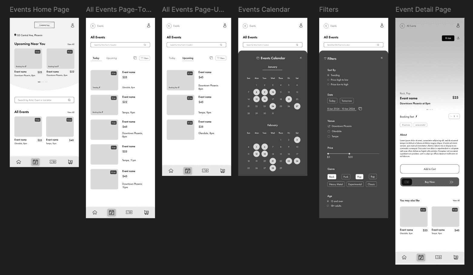
Event list/Calendar of events
Create a design that would list events from all three venues in a single screen. Include filters for date, venue, genre, or combinations of these to help users narrow their search. Allow users to click on the the event listings to access more details about the event, purchase a ticket and suggested related events.
User Accounts
The stakeholder wanted to see few flow options here-
1. Allow users to sign up by creating an account and giving them the option to add billing/payment info.
2. Show an error screen for incomplete required fields during sign-up.
3. A tickets page where the user can see a list of upcoming tickets and access their purchased virtual tickets.
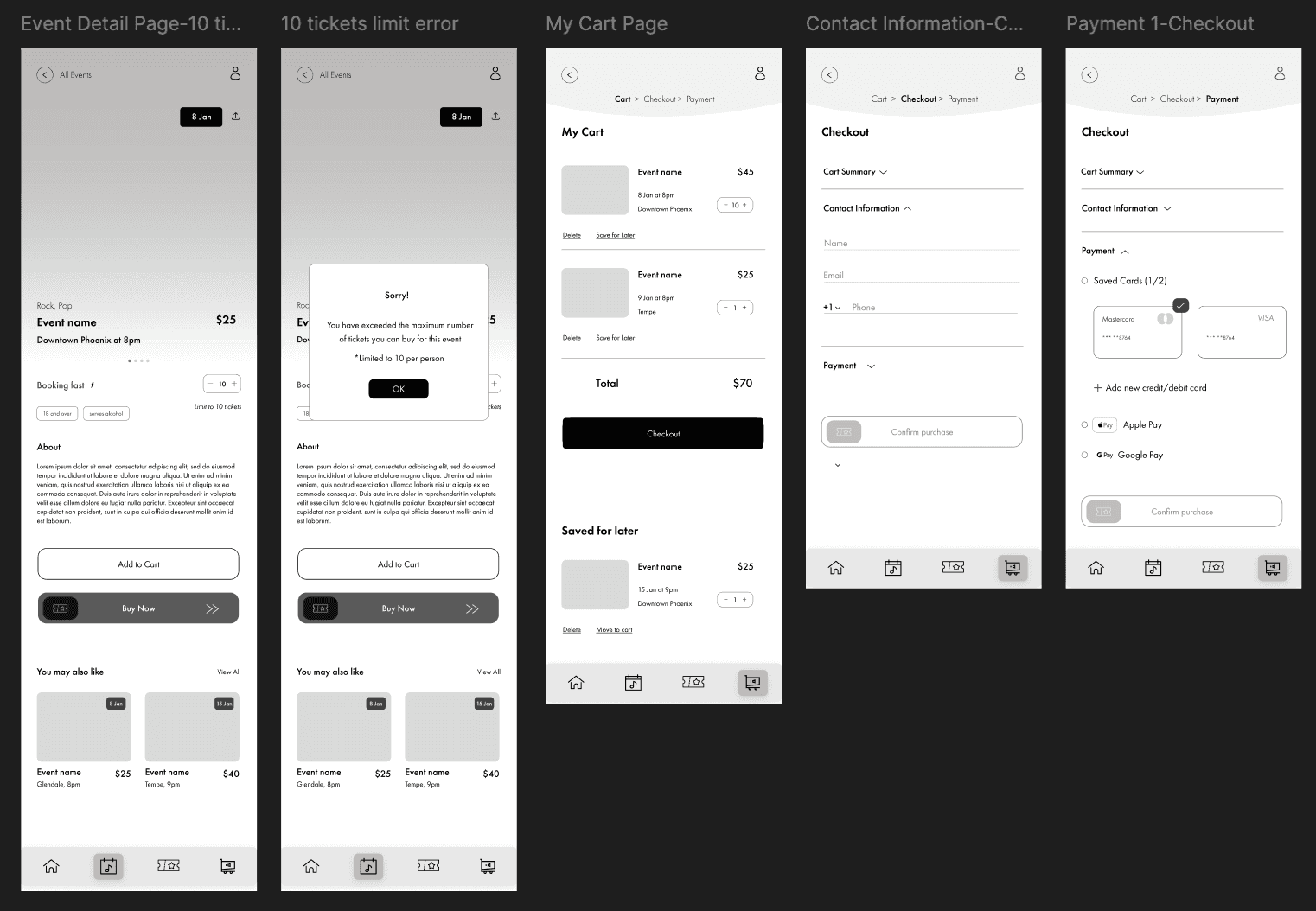
Purchase a ticket
1. Design the process to purchase tickets from the event page to a checkout confirmation screen
2. Create the flow where users go directly from the event page to checkout with one click
Problem
“We want our fans to focus on the music, not on figuring out where to buy tickets”
Concertgoers struggled with navigating three separate websites to find events and purchase tickets, leading to confusion and inefficiencies for both users and the business. This fragmented experience affected the company’s ability to promote events effectively and encourage cross-venue attendance.
Process
Research
Given the limited scope of the project, I had to condense the research phase and worked with the provided personas to represent the target users. Using these personas as a foundation and considering stakeholder requirements, I developed some low-fidelity wireframes for the user flows. Through these wireframes, I was able to demonstrate how the app would function and quickly iterate by incorporating feedback from the stakeholders throughout the process.
Wireframes
Event list/Calendar of events
User Accounts


Purchase a Ticket

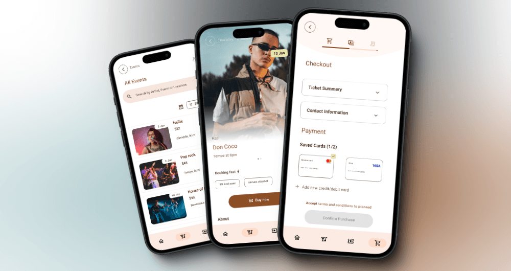


Prototypes
View Prototype
Stakeholder Presentation
Reflection
Deciding on the best solution was challenging due to limited time and a constrained project scope. With more time, I would have delved deeper into alternative problem-solving methods as well
I would have tested the app in varied contexts, like at home versus on the go, to better address user needs in different scenarios
Allocated time for real-world user testing, as gathering user feedback through iterative testing cycles would have helped assess the design’s effectiveness
Worked on adding accessibility features to make the app more inclusive and user-friendly
